
How Custom Signs and Banners Help Create a Strong Business Presence
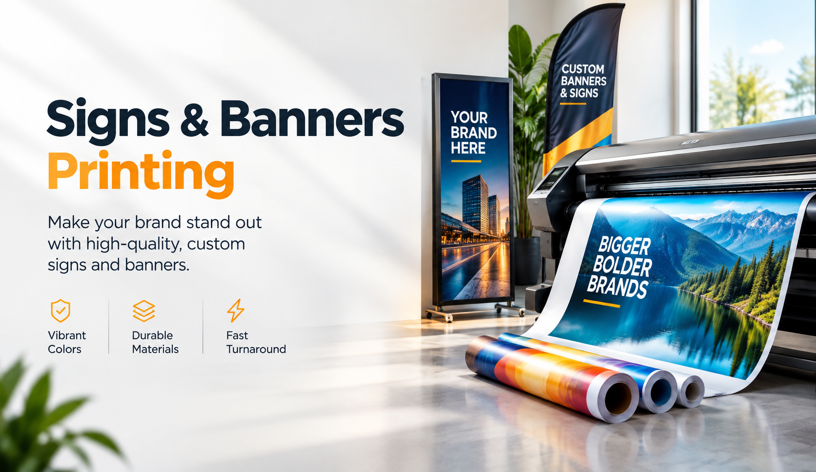
A customer can drive past a business every day and still have no clear idea what happens inside. We see this more often than many business owners expect. The storefront may look clean, the service may be excellent, and the location may get plenty of traffic, yet weak signage makes the business easy to overlook.
That problem becomes even more noticeable when a company relies on walk-in customers, local traffic, events, temporary promotions, or a physical location. People need to notice the business first, understand what it offers, and know what to do next. Effective Signs and Banner Printing helps communicate those things without asking customers to stop and study the display.
Good signage does not need to shout. It needs to work. A clear sign at the right location can reinforce a business name, direct visitors, announce an offer, identify an entrance, or simply make the property feel more established.
Custom Signs and Banners Build Visibility Where Business Happens
Most local businesses compete for attention in busy surroundings. Storefronts sit beside other storefronts. Event booths line up next to dozens of competitors. Construction, parked vehicles, trees, neighboring signs, and everyday street activity all compete for a customer's eye.
A custom sign gives the business a permanent visual reference point. A banner adds flexibility when the message needs to change. Together, they can support both everyday brand visibility and short-term communication.
Visibility Starts Before a Customer Reaches the Door
We often encourage businesses to look at their location from the customer's point of view rather than from inside the building. A sign that looks large from ten feet away may almost disappear from the road.
Viewing distance changes everything. So do traffic speed, surrounding colors, sign height, lighting, and the amount of information on the design.
A customer driving past a storefront has only a few seconds to notice the business. That usually makes a simple company name, recognizable brand colors, and one useful message more effective than a design filled with services, phone numbers, slogans, social handles, and small-print details.
Banners Create Flexible Visibility
Permanent signs serve one purpose. Banners solve another.
Businesses regularly need temporary signage for grand openings, seasonal sales, community events, renovations, new services, hiring notices, sponsorships, and limited-time promotions. Printing a permanent sign for every change rarely makes sense.
A custom banner lets the business communicate a timely message while keeping the primary storefront branding consistent. Businesses can also move banners between locations, store them for recurring events, or replace the message when priorities change.
Strong Business Signage Makes a Brand Easier to Recognize
Brand recognition rarely comes from one advertisement. Customers usually build familiarity through repeated exposure to the same visual identity.
They may first see a storefront sign, then receive a postcard, visit a website, notice a vehicle graphic, or encounter the business again at an event. When the colors, typefaces, logo treatment, and general visual style remain consistent, those separate interactions start to feel connected.
Consistency Matters More Than Decorative Design
One mistake we see in print projects involves designing each marketing piece in isolation. A business may have a professional logo but use completely different colors on its banner. The storefront sign may use one font while printed materials use several others.
Nothing looks dramatically wrong on its own, yet the business loses some of the recognition that consistent branding creates.
Signs and banners should feel like extensions of the existing brand. They do not need to copy every other marketing piece exactly, but customers should immediately recognize the connection.
Professional Presentation Shapes First Impressions
Customers form opinions quickly when they approach a physical business.
A faded banner tied unevenly to a fence communicates something different from a clean, properly sized banner with secure finishing. A temporary paper notice taped over an old sign creates a different impression from a professionally printed update.
That does not mean every business needs expensive signage. It means the condition, readability, placement, and design of the sign should match the experience the company wants customers to expect.
A simple sign executed well often creates a stronger impression than an elaborate design executed poorly.
Custom Signs Help Customers Understand a Business Faster
Visibility alone does not solve every problem. A customer also needs to understand the message.
We regularly see signs that contain plenty of information but fail to communicate one clear point. When customers need several seconds to determine what a sign means, the design has already created unnecessary friction.
Every Sign Needs One Primary Job
Before designing a sign or banner, we usually start with a basic question: What should someone understand after seeing it?
The answer may include:
-
This business operates here.
-
The entrance sits around the corner.
-
A sale runs this weekend.
-
The company now offers a new service.
-
An event takes place at this location.
-
Customers can park in a particular area.
Once the purpose becomes clear, design decisions become easier. The headline, text size, color contrast, imagery, dimensions, and placement can all support one primary goal.
Too Much Copy Weakens the Main Message
Business owners understandably want to use every available inch. Printing space feels valuable, so leaving empty space can seem wasteful.
In practice, that empty space often improves communication.
A banner that lists ten services may communicate less effectively than one that highlights a business name and one primary service. Customers rarely stand still long enough to read a paragraph from a roadside banner.
We would rather make three important words easy to read than squeeze thirty words into a design nobody can process from a realistic viewing distance.
Sign Design Must Match Real Viewing Conditions
A design can look excellent on a computer screen and still fail after installation.
Computer screens place the artwork directly in front of us. Real signs may sit twenty, fifty, or several hundred feet away. Sunlight can hit them. Vehicles can block them. Customers may approach them from an angle rather than straight ahead.
That gap between screen design and real-world use explains many disappointing signage projects.
Letter Size Needs to Match Viewing Distance
Small lettering creates one of the most common problems.
Designers sometimes shrink text because everything needs to fit within a fixed banner size. The finished artwork looks balanced on screen, but the actual sign becomes difficult to read across a parking lot or from a moving vehicle.
Before printing, businesses should identify the likely viewing distance and prioritize the information people need to see first. Our guide to banner visibility covers this issue in more detail.
Contrast Improves Readability
Color choice affects more than appearance.
Dark text on a dark background forces the reader to work harder. Thin lettering can disappear against photographs. Busy backgrounds compete with headlines. Similar shades may look attractive on a monitor but lose definition from a distance.
Strong contrast makes important information easier to recognize quickly. Businesses can still follow their brand colors while adjusting shades, backgrounds, borders, or typography to improve visibility.
Typography Needs Restraint
Decorative fonts have their place, but large-format advertising rewards clarity.
For most signs, we recommend keeping the number of typefaces limited and creating hierarchy through size and weight. The business name or main message should command attention first. Supporting information should come second.
When every line uses a different font, color, or style, nothing receives clear priority.
The Right Sign Material Depends on Location and Purpose
Businesses often focus heavily on artwork and leave material selection until the end. Material deserves just as much attention because the environment determines how the finished piece needs to perform.
A sign intended for a climate-controlled reception area has very different requirements from a banner mounted outdoors for several months.
Outdoor Signs Need Durability
Outdoor signage deals with sunlight, moisture, wind, dirt, temperature changes, and physical handling.
Businesses should consider how long the sign needs to remain outside, where installers will mount it, and how much exposure the location receives. Those factors can influence material thickness, finishing, mounting hardware, and print choice.
A short-term event banner does not always need the same construction as signage that will remain outside every day.
Indoor Displays Can Focus More on Presentation
Indoor signage faces fewer environmental stresses, so businesses can place greater emphasis on finish, surface appearance, and close-range viewing.
Reception signs, event displays, presentation graphics, mounted posters, and directional signage all benefit from clean finishing because customers often view them from only a few feet away.
At that distance, small alignment problems, low-resolution images, and poor finishing become much easier to notice.
Material Should Follow the Application
We prefer to choose the product after understanding the job.
A business may need vinyl banners for one application, aluminum signs for another, yard signs for temporary outdoor messaging, window graphics for storefront visibility, or retractable banners for trade shows and presentations.
Choosing the product first can lead to compromises later. Starting with location, duration, viewing distance, installation method, and budget usually leads to a more practical decision.
Signs and Banners Support Local Marketing Beyond the Storefront
Business signage does more than mark a building. Companies can use it throughout the customer journey.
A customer might notice a roadside banner, follow directional signs into a parking area, see a promotional display near the entrance, and encounter additional branded signage inside. Each piece helps move the person through the physical space.
Events Need Fast Brand Recognition
Trade shows, community events, school functions, fundraisers, open houses, and local festivals create crowded visual environments.
Visitors may walk past dozens of booths within a short period. Businesses need enough visual identity for someone to recognize who they are before deciding whether to stop.
A clean banner behind the table often provides more value than covering the booth with several competing messages. Once visitors approach, brochures, business cards, samples, staff conversations, and other materials can provide the details.
Temporary Promotions Need Clear Time-Sensitive Messaging
Temporary offers require a different approach from permanent branding.
A restaurant may promote a seasonal menu. A retail store may announce an opening. A service company may introduce a new location. A property manager may need leasing signage.
In these cases, banners give businesses room to communicate the current message without altering permanent signage.
The design still needs to match the brand, but the message can become more immediate.
Directional Signs Improve the Customer Experience
Not every sign needs to advertise.
Some of the most useful signs simply help customers figure out where to go.
A visitor who cannot find the entrance, parking area, pickup counter, registration desk, or correct building suite starts the interaction with frustration. Staff then spend time answering questions that better signage could solve.
Wayfinding Removes Unnecessary Friction
We suggest walking through the property as though you have never visited it before.
Start where a customer arrives. Look for moments where someone might hesitate. Can they identify the correct driveway? Do they know which door to use? Can they find reception? Does the checkout or pickup area make sense?
Those small points often reveal where directional signage can improve the experience.
Clear Signs Can Reduce Repetitive Questions
If staff members answer the same location question every day, signage may need attention.
That question could involve parking, restrooms, check-in procedures, pickup areas, entrances, or waiting areas. A strategically placed sign can give customers the answer before they need help.
The result feels smoother for customers and gives employees more time to focus on service.
Common Sign and Banner Mistakes Businesses Can Avoid
Many signage problems do not come from printing quality. They start with planning.
We have found that a few simple checks before production can prevent the majority of disappointing results.
Designing Without Considering the Installation Site
A banner may have perfect dimensions on paper but leave nowhere for installers to secure it properly.
Before production, confirm the available space, mounting surface, obstructions, wind exposure, viewing angle, and attachment points.
Photos and measurements help considerably when a print provider needs to recommend dimensions or finishing options.
Using Low-Resolution Artwork
Large-format printing does not magically improve a small image.
A logo copied from a website, social media profile, or screenshot may look acceptable on a phone but lose sharpness when enlarged several feet wide.
Whenever possible, businesses should provide vector logos or appropriate high-resolution artwork. A print provider can then check whether the files suit the intended production size before printing.
Forgetting the Viewing Distance
This mistake appears frequently because owners review artwork from close range.
Step several feet away from the screen or print a scaled proof. Look at the design quickly rather than studying it. Can you identify the business name and primary message immediately?
If not, the design probably needs stronger hierarchy.
Treating Every Inch as Advertising Space
More information rarely creates a stronger sign.
Phone numbers, QR codes, websites, addresses, service lists, slogans, social accounts, credentials, and promotional text can all seem important. Putting everything on one banner usually makes every element smaller.
Choose information according to where customers will see the sign and what action makes sense in that setting.
How We Approach a Practical Sign or Banner Project
A productive signage project begins before artwork reaches the printer.
We first want to understand the physical environment and business goal. Those details guide the decisions that follow.
Start With the Business Objective
Businesses should define what success means for the particular piece.
Does the sign need to identify a location? Generate walk-in traffic? Direct visitors? Announce an event? Build brand recognition? Promote an offer?
A clear objective prevents the design from turning into a collection of unrelated messages.
Review the Location
Next, consider where customers will see the sign.
Measure the space and note the viewing distance. Look at nearby colors and visual distractions. Consider whether people will walk, drive, or stand near the display.
A storefront banner facing moving traffic needs a different design from a sign beside a reception desk.
Build a Clear Visual Hierarchy
We generally organize information around three levels:
The main message comes first. The business identity comes next when it does not already serve as the headline. Supporting information follows only when customers realistically have time to read it.
This hierarchy helps the eye move through the design naturally.
Proof the Details Before Printing
Large-format mistakes become expensive quickly.
Before approval, check spelling, dates, phone numbers, website addresses, prices, event times, dimensions, image quality, and final artwork placement.
For signs that require installation, check finishing details as well. Confirm grommets, pole pockets, mounting holes, orientation, and any required margins before production starts.
Custom Signage Works Best as Part of a Consistent Brand System
A sign should not operate separately from the rest of a company's marketing.
Customers may encounter the business through search results, direct mail, social media, a referral, printed collateral, or the storefront itself. Consistent branding helps those touchpoints reinforce one another.
Match Physical and Digital Branding
The sign does not need to duplicate a website, but both should clearly represent the same business.
Use recognizable colors, logo treatments, and typography. If a customer sees the storefront and later searches online, the transition should feel familiar.
That consistency can also reduce uncertainty. Customers gain confidence when the business they find online looks like the business they see in person.
Keep Temporary Materials on Brand
Seasonal banners and event signage sometimes drift away from the core visual identity because businesses create them quickly.
Even temporary messages benefit from consistent brand colors, logo use, and typography. The offer may change, but the business behind it should remain recognizable.
Measuring Whether Business Signage Actually Works
Signs do not offer the same tracking data as a digital advertisement, but businesses can still evaluate their effectiveness.
The right measurement depends on the purpose of the sign.
Watch Customer Behavior
Employees often notice useful patterns first.
New customers may mention that they saw the banner while driving past. Visitors may stop asking where to park after directional signs go up. An event display may attract more conversations when the headline becomes easier to understand.
Those observations provide useful feedback.
Use Trackable Actions Where They Make Sense
Some signs can include a dedicated landing page, QR code, promotional code, or campaign-specific phone number.
We would not add those elements automatically. A roadside banner may not give drivers enough time to scan anything safely. A poster inside a waiting area, however, may give customers several minutes.
Tracking should support the context rather than clutter the design.
Frequently Asked Questions
What Information Should a Business Put on a Custom Banner?
Start with the primary message customers need to understand. Add the business name or logo and one relevant call to action when space and viewing conditions allow. Avoid filling the banner with every service, contact method, and social profile.
For roadside or long-distance use, fewer words usually improve readability.
What Size Should a Business Banner Be?
The right size depends on viewing distance, available installation space, message length, and location. A banner mounted across a building needs different dimensions from one placed behind an event table.
Measure the installation area first, then design around realistic viewing conditions rather than choosing a standard size without context.
Are Vinyl Banners Suitable for Outdoor Business Use?
Vinyl works well for many outdoor banner applications because it combines strong print reproduction with practical durability. However, businesses should still consider wind exposure, installation method, duration, and local conditions.
For windy areas, the specific banner material and mounting approach can matter as much as the artwork itself.
How Can Businesses Make Their Signs Easier to Read?
Use a clear headline, strong contrast, appropriately large lettering, simple typography, and enough open space around important information. Test the design from the expected viewing distance before approving it.
Most importantly, decide what viewers need to notice first and make that element visually dominant.
A Strong Business Presence Starts With Clear Communication
Custom signs and banners work because they communicate in the places where customers already interact with a business. They identify locations, strengthen brand recognition, guide visitors, support promotions, and help people understand what a company offers without adding unnecessary friction.
The strongest projects rarely rely on complicated design. They rely on clear priorities: the right message, readable typography, appropriate materials, realistic viewing conditions, and consistent branding.
We also encourage businesses to think beyond the artwork itself. Where will people stand when they see the sign? How quickly do they need to understand it? What information actually matters at that moment? Those questions often make the difference between signage that simply fills a space and signage that serves a real business purpose.
At Laguna Digital, we approach signs and banners as practical communication tools rather than decoration alone. If you are planning new storefront signage, an event banner, directional displays, or a temporary promotion, start with the location and the customer experience. A clear plan makes the design process easier and gives the finished piece a much stronger reason to exist.

 English
 Arabic
 French
 Spanish
 Portuguese
 Deutsch
 Turkish
 Dutch
Dutch
 Russian
 Romaian
 Portuguese (Brazil)
 Greek
Greek