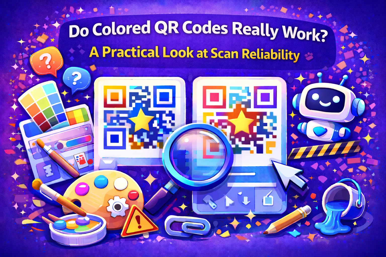
Do Colored QR Codes Really Work? A Practical Look at Scan Reliability

Colored QR codes often spark hesitation. They look great, match branding, and feel modern — but many people still ask the same question before using them:
Will this actually scan?
The concern is understandable. QR codes are meant to be fast and effortless, and anything that introduces doubt feels risky. The good news is that colored QR codes do work — when a few technical rules are respected.
Color Isn’t the Problem — Contrast Is
QR scanners don’t recognize colors the way humans do. They look for clear differences between dark and light areas.
That means:
-
A colored QR code can scan perfectly
-
A black-and-white QR code can fail
The difference isn’t color — it’s contrast.
High contrast between the QR pattern and the background is what allows scanners to recognize the code quickly and accurately.
Examples of Reliable vs Risky Color Choices
Generally reliable
-
Dark blue, dark green, or dark red codes on white backgrounds
-
Solid colors with sharp edges
-
Clean backgrounds with no texture
Common causes of failure
-
Light gray or pastel QR codes
-
Low-contrast brand color combinations
-
QR codes placed over photos or patterns
If the QR code blends into the background visually, scanners will struggle — especially in less-than-perfect lighting.
Why Lighting Changes Everything
A QR code that scans instantly indoors may fail outdoors.
Lighting issues that affect colored QR codes:
-
Sunlight glare washing out contrast
-
Shadows obscuring parts of the code
-
Reflections from glossy surfaces
-
Dim or uneven indoor lighting
The lower the contrast, the more sensitive the QR code becomes to these conditions.
Printed Colored QR Codes Need Extra Care
Digital screens are forgiving. Printed materials are not.
With printed QR codes:
-
Ink absorption can reduce contrast
-
Paper texture can blur edges
-
Small sizes amplify design flaws
For printed colored QR codes, darker colors and larger sizes are much safer than subtle or decorative designs.
Combining Colors With Logos Increases Complexity
Using color alone is usually safe when contrast is strong. Adding a logo on top of that introduces another variable.
If you use both:
-
Keep the logo small
-
Avoid light colors near the center
-
Use higher error correction
-
Test more than once
Each visual element reduces the margin for error.
Safe Customization Guidelines
Colored QR codes perform best when customization is restrained.
Good rules to follow:
-
Prioritize contrast over aesthetics
-
Avoid gradients and transparency
-
Keep backgrounds clean
-
Test before printing or publishing
Platforms like https://qrcolor.com are designed to support color customization while protecting scan reliability, making it easier to experiment without breaking functionality.
Testing Is the Final Check
No design rule replaces real testing.
Before using a colored QR code, scan it:
-
On different phones
-
With different camera apps
-
In multiple lighting conditions
-
At the exact size it will be used
If scanning ever feels slow or unreliable, increase contrast or simplify the design.
When Black-and-White Is Still the Best Choice
There are situations where colored QR codes aren’t worth the risk:
-
Very small QR codes
-
Long-distance scanning
-
Poor or unpredictable lighting
-
High-stakes use cases
In these cases, traditional black-and-white QR codes remain the most dependable option.
Final Takeaway
Colored QR codes absolutely work — but only when contrast, environment, and design are taken seriously. Most failures aren’t caused by color itself, but by subtle design choices that reduce visibility.
When clarity comes first and branding follows carefully, colored QR codes can scan just as reliably as classic ones — without sacrificing visual identity.
- Business
- Art & Design
- Technology
- Marketing
- Fashion
- Wellness
- News
- Health & Fitness
- Food
- Spiele
- Sports
- Film
- Startseite
- Literature
- Music
- Networking
- Andere
- Party
- Religion
- Shopping
- DIY & Crafts
- Theater
- Drinks
